Learning Analytics Dashboards
Report brief
Informing Training Design Through Learning Analytics Dashboards
Original report by:

1. Operational context
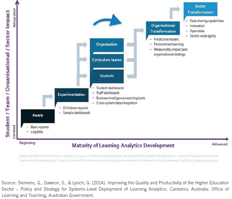
In 2020, a report was commissioned by the Office of the Director of Training to develop high-level advice on the consolidation of the Centre’s learning analytics system in light of the overall digital transformation of the Centre. It developed two major visions and five challenges, including a short-, mid- and long-term roadmap to provide the Office of the Director of Training with the ability to systematically analyse and interpret learning data. The authors, Drachsler and Kalz, used the learning analytics sophistication model to evaluate the current state of LA at the Centre and assessed it as being situated between Step 2 and Step 3.
The aim of the report is to present a roadmap for reaching Step 3 of the learning analytics sophistication model. Based on Drachsler and Kalz’s report from 2020, the current learning analytics status of the ITCILO is analysed in terms of the dashboard design and its implementation in organizational processes.
See previous report for recommended actionables.
The roadmap, technical and organizational steps recommended in this report are meant to be the stepping stone for a long-lasting improvement process that involves continuous re-invention of learning analytics at the Centre, continuous improvement in moving to and beyond Level 3, and towards being a pioneer in digital transformation as a training organization.
2. Key takeaways from the 2020 report
The Centre is situated between Step 2 and Step 3 of the learning analytics sophistication model
- Several dashboards are offered to different stakeholders in the organization however, there is little focus on actual learning data.
- Currently, the dashboards mainly serve the purpose of identifying existing KPIs based around financial data and outreach statistics.
- Moving to Step 3, includes providing all stakeholders with a dashboard that gives insight into a fully connected set of data at the micro, meso and macro levels
Learning Analytics Dashboards should
- be based on a clear educational concept, rather than showing all available data
- use well-defined reference frameworks (social, achievement and / or progress)
- focus on constructivist learning.
Data sources should not only include activity data but also take into account the content of completed assignments
Several groups of indicators relating to learners, actions, content, results, context and social factors, require different kinds of data sources.
Objectives
- Micro dashboards might include metacognitive, as well as the cognitive, behavioral and emotional, progress of the learner.
- Meso dashboards focus on courses and students at a high level of risk and allow drill-down to find out the reason and take appropriate action.
- The ITCILO operates in four fields: strategy, business development, clients and customers. Learning data is not one of them.
- The systems lack SSO support, which increases the difficulty in collecting user-related data on third-party tools.
Shift the Centre’s paradigm towards a data-driven course-provider platform, focusing more on lifelong learning and continuous professional development
- Repeat participants should be taken into consideration
- More complex indicators based on learning data should be used as KPIs
- Product Owners should be enabled to iterate on the existing dashboards and modify them over time.
Infrastructure
- New technology was recommended for more granular tracking of user activity
- Data collection should be applied to all customer services, including learning activities realized using third-party software
- A data-lake solution might be considered as a way of improving the infrastructure.
Data and indicators
- Increase the focus on collecting knowledge-acquisition data
- Existing indicators that map collected data should be reframed and pulled together into more meaningful and applicable compound indicators.
- On the meso level, the collection of satisfaction and engagement data was not yet made available to dashboard users.
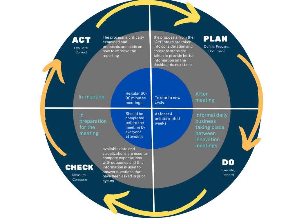
The PDCA Cycle
Should be used to support future evidence-centered learning design by using the data and insights gathered as an integral part of learning design for new courses or the overhaul of existing ones.
User-centricity
- Future dashboards should emphasize prioritization and avoid over-complication
- Consider the user experience by creating clean LADs that benefits from clear communication and the reduction of visual messages
- Provide training opportunities to achieve higher data literacy and a Code of Practice should be provided to the dashboard users to raise awareness of how to usefully apply dashboards to everyday work.
A clean Learning Analytics Dashboard needs to take into consideration the user experience, which benefits from clear communication and the reduction of visual messages to a minimum in getting the necessary points across.
3. Conceptualization
The following diagram illustrates the technical infrastructure for handling LA data. This is not meant to represent only the current state of affairs, but also includes modifications and clean-up planned for the near future.
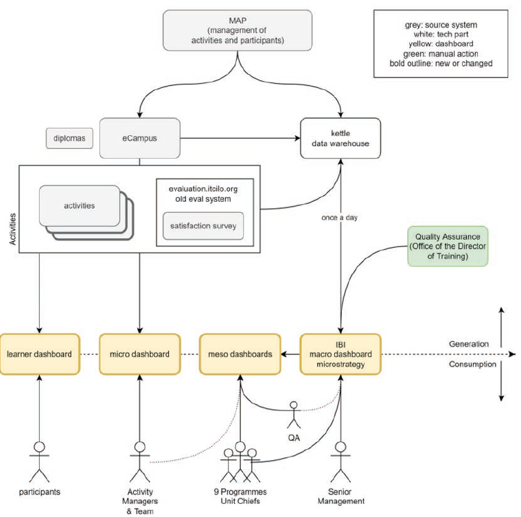
ITCILO's current infrastructure
While not focused exclusively on learning, IBI focuses on the macro perspective. On eCampus, there is a micro-level activity manager dashboard, which gives access to course and activity completion states and grades by user.
Online learning platform - eCampus
- The micro-dashboard has been built to track course completion rates. It gives the activity manager the ability to drill down into the performance of every participant and see which activities have been completed and with which grade (if applicable). This data is also made available to the participants by means of a progress bar on their dashboard and on the course landing page.
- Several activity types were added or used more often in 2021 to accommodate the increase in distance-learning. These include webinars (via Zoom and Webex), increased use and evaluation of KATs, and other TinCan-compatible tools like Padlet and Articulate. With the exception of the KATs, user interaction during use of these tools cannot be measured at present.
Data warehouse - Kettle
- It collects data from the MAP and eCampus systems, maps and pushes it to the IBI, where it can be displayed.
- Kettle snapshots the data once every 24 hours (at night) and processes it into its own structured SQL database.
- The time dimension of the data is not taken into consideration
Business Intelligence - IBI
- It provides a macro overview of the Centre’s activities, historically focused on financial and governance data and KPIs, including their achievement rates.
- The user can drill down to the precise participant or activity that generated the data and find out exactly how the aggregated data is constructed.
- There are several additional dashboards that show only high-level KPIs, in accordance with the biennial planning cycle.
End of course satisfaction - Eval
It will soon be integrated into the eCampus as a Moodle module. In this way, data will no longer need manual extraction via Excel sheets, but can be collected by Kettle, like all other quiz results.
Digital credentials
The system allows insights into many aspects such as sharing credentials on social media, automating credential creation and linking to the correct person.
Metadata - MAP
- It holds all relevant metadata about Centre activities and participants. It is one of the two primary sources of data alongside the eCampus but is not visible to end users.
- MAP data hides behind the data warehousing software, is collected automatically, and can be made available on existing and future dashboards.
This proposal for a plan to build future LA dashboards attempts to integrate existing solutions as best as possible to avoid duplication and unnecessary effort. In general, the current set-up is capable of reaching Step 3 of the LA sophistication model.
4. Modeling
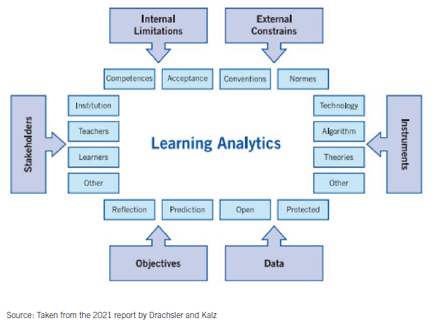
This process will be based on the dimensions of learning analytics proposed by Drachsler and Kalz in the previous report.
I. Stakeholder analysis
Because of the different needs, different dashboards need to be created. A one-size-fits-all solution would not only violate several objectives but would also go against the principles of the user-experience design.
When considering different stakeholder groups, it is important to note that some are interested in a well-defined information space, while others play a transversal role.
- Participants
- Coaches / Tutors / Activity Managers and their teams (Micro perspective)
- Cluster managers / Programme Managers (Meso perspective)
- The Learning Innovation Programme (Transversal approach)
- The Director of Training and Senior Management (Macro perspective, KPI-oriented)
- Quality Assurance (Transversal approach)
- ICTS
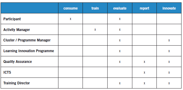
The most common activities include the consumption of training, training itself, evaluation of current or past training activities, reporting on past activities, and innovating the training process itself. This matrix is essential for understanding which indicators are useful for which roles in the organization.
Several dashboards are required. At first glance, an obvious choice would be four dashboards, for the micro, meso and macro levels, with the micro level separated into internal micro for activity managers and external micro for end users.
In the ITCILO, there are several people working on improving training quality, so it is worth designing the dashboards with this situation in mind.
When reporting numbers for the biennial report, the questions asked and the data presented should be different from the data used when analyzing the situation for the longer-term gain of the educational process. The dashboards, especially on the macro level, should allow for a differentiation between biennial KPI reporting and deep fundamental analysis of educational processes that is not suited for regular reporting but is desperately needed for learning innovation.
II. Objective analysis
There are four major objectives to fill in the delta between the status quo and what can be considered as being on Step 3 of the learning analytics sophistication model.
Objective 1. Measure Early, Measure Often
- The current effort made to collect data is in support of existing KPIs, mostly outside of the learning process.
- Via the dashboard indicators, we suggest a first set of parameters that need to be adjusted in an ongoing process.
- By proactively defining learning KPIs in addition to existing knowledge-acquisition and application KPIs, the Centre puts itself in the driver’s seat and in a position to actively intervene in educational processes.
Currently, data is only collected before and after the complete journey. This is largely due to the shift from comparatively short face-to-face courses to distance learning on a very large scale. Given the intended further expansion of distance learning, collecting relevant data early and often needs to be a major focus. Ideally, there should be several arrows in each row for collecting real-time learning data.
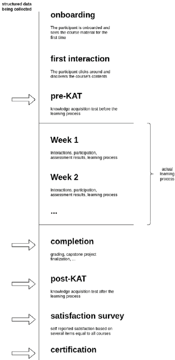
ITCILO's current data-collection points
Objective 2. Introduction of Meso level and Transversal Functionality
- New indicators need to be crafted to best represent the Centre’s plethora of different didactic modes in an abstract summary on the meso or macro layer.
- The different objectives of different stakeholders need to be taken into account when considering which data to show on the respective dashboards.
- A requirement to keep in mind is the transversal view necessary to accommodate the everyday work of the Quality Assurance and Learning Innovation teams.
Objective 3. Differentiate measurement of effectiveness
- Currently, the progress of a participant in a course is tracked exclusively through completion and the grade assigned for a completed activity.This does not necessarily allow for sensible conclusions to be drawn about the participant’s engagement or fundamental understanding of the topic at hand.
- There needs to be a way of measuring participant’s involvement that does not rely purely on exposure rates, but takes into consideration whether or not the participant can be considered to have understood whatever learning outcome the lesson was to convey. Ex. Analyzing forum posts contents.
Objective 4. Answer questions; don’t show data
- The design of the dashboard-user experience can help to ensure that the data is used in an effective way.
- When designing dashboards, it is essential to ask the right questions.
- Objective analysis should be repeated regularly in the ongoing effort to improve learning design.
- When such awareness is created it is useful to think what story the dashboard needs to tell in order to answer these questions.
- A dashboard should not include any information that has not been asked for in the form of a question that reflects a stakeholder’s everyday concerns. Rather, it should focus on the user journey that best fits the requirements defined in the “Plan” stage of the PDCA cycle, and should offer that information directly without the need of interpretation.
- Using graphic representations rather than text output further increases usability.
- Warn the user when the data displayed on a dashboard could wrongly be thought to answer a particular question, when in fact it answers a different question.
A good dashboard is not an Excel report, but rather the condensed information that someone has already pulled out for you, which then enables you to draw conclusions on how to act on it.
III. Data analysis
- Differences in course design need to be respected and highlighted in all instances.The Centre’s activities are diverse and require different indicators to best capture data.
- The Centre's different modes of training include face-to-face, online tutor-supported, online self-guided, and blended learning.
- The used activity types are diverse and include downloadable non-trackable, interactive non-trackable, videos, forums, quizzes, webinars, written assignments, Moodle profile completion activities.
- There are three certification types at the ITCILO: certificates of participation, certificates of achievement and diplomas.
- When analyzing participant performance directly or indirectly, several participant dimensions can and should be taken into account; region, repeat participants, self-paid participants, professional context.
Pioneering a project is significantly easier if there is an appealing narrative to accompany it
-Tesla
IV. Instrument analysis
The indicators and dashboard structure have been deduced from first principles, then what derives the data that needs to be shown was determined, and finally UX design principles were applied to make them as digestible as possible.
- Visualization of data and what is really measured
- Compounding
- Relative dimensions
- Contextual indicator
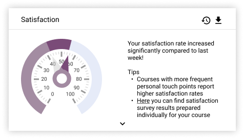
- Satisfaction Indicator
- Enrolment status
- Participation level
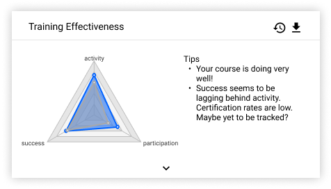
- Success indicator
- Course progress by activity, participation and success
- Availability of Data
- The category of data selected is classified in terms of depth of interaction.
- Starting only with metadata and self-reflected satisfaction levels, which are currently used as KPIs, the metrics become increasingly involved.
- Depending on the perspective of the user, the green or purple data might be shown.
- Compounding these metrics is a delicate procedure since it is the deciding factor in delivering relevant and accurate indications. The alternative would require an extraordinary degree of data literacy and time investment on the part of all dashboard users.
- Certain users at the Centre should always be allowed a deeper look behind the compound indicators to enable them to improve the indicators and better understand the data. An “advanced” view will therefore be considered, giving graded access to more layers of complexity.
- It is essential that the automatic compounding process give access to detailed in-depth data from the data sources themselves, rather than only data aggregated for the prior logical step.
- Relative reporting implies an immediate context in the user’s mind, while absolute reporting broadens the focus. This can be achieved by showing last year’s data or data from similar courses above any given indicator. The less a user is involved with the data, the more this approach supports decision making in a desired direction.
- The deliberate structuring of dashboards by including or omitting data related to desired behavioral change, and displaying relative comparisons as a means to provoke action in the user’s mind, is an apt tool for expediting the standardization and formalization of online courses in an informal way.
- Another relative dimension of use is the comparison of cohorts, which can be applied to A/B test a new tool or didactic approach.
- To determine similarity, topical relations should be highly prioritized. However, there are other attributes to be taken into consideration: a similar course can be found by examining the metadata and learning history of participating learners.
- This indicator takes into account metadata from MAP.
- It provides an overview of different attributes of the participant dimensions.
- This data is already well-established and represented in IBI. Similar approaches can be applied here.
- Simple messages be derived from this data to help activity managers and their teams gain an overview of whom they are facilitating.
- It is detrimental to show graphs of this indicator in the first instance. Only predefined messages with the respective ratio or metric should be shown.
- When interacting with the indicator by hovering or clicking, a useful graph can optionally be shown to allow a deep dive into the data, whenever necessary.
- It gives quick access to the data collected from satisfaction surveys.
- A list of the five most deviating items - in positive or negative direction - can be shown and optionally expanded.
- In pursuit of Objective I (measure early, measure often), it would be prudent to retrieve rudimentary satisfaction data from participants as they are progressing through the course.
- If collected, the ongoing satisfaction data could be shown as a distribution over time. They should not be mixed with the survey results.
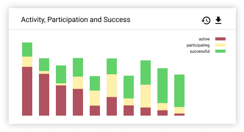
- It is an indicator of the current state of activity on the course.
- Its main purpose is to give an overview of whether and how many participants are properly on-boarded and have started actively participating in the course.
- It takes into account the aggregated data from the presence-, engagement- and activity-level layers, as well as the metadata collected from the MAP.
- Participants are separated into different states of enrollment: Registered, Engaged, Active, Successful, Certified, Dropped-out.
- Much of this data is already shown on the current activity-manager dashboard on the eCampus. This view can be expanded to show more detailed status indications for each participant.
- It is essential to go into detail and understand what exactly is happening at the micro level and have the opportunity to make a tangent analysis at the meso level.
- When participation levels are viewed by activity type, problems can be tracked down to their real reasons.
- This indicator only takes into account interactive users and displays data over time.
- This indicator is concerned with generating an aggregated participation score and distribution across different activity types.
- This indicator aggregates data from the activity, quality-of-results and effectiveness layers.
- It shows quiz scores and assignment grades, and also takes into account the completion rate. As a next step, analysis of the written forum entries can be included.
- The pre-KAT and post-KAT evaluations, which are mandatory for all courses, can be used as a reliable after-the-fact measure of success. The improvement from pre- to post-KAT can be used as a goodness-of-fit test for the success data collected on the ongoing course.
- Especially on the macro level, a bird’s-eye view of all participants is necessary.
- A stacked bar chart is well suited to display both the total number of active participants over time within the average course and their respective depths of involvement. A given bar represents the nth week of a course. Towards the end of the course, one should see the share of successful participation increase, while the share of participants who are merely active decreases.
- Users should be allowed to make distinctions by mode of training.
- Depending on the objective, it should also possible to use aggregated numbers of participants instead of weekly measurements, or add the certification dimension as a fourth color, at the same time extending the timeline to after the official end of the course.
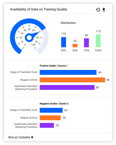
- This meta-indicator is an important step towards achieving better data quality and provides an outside evaluation of how well a course can be measured in terms of the indicators used.
- The insights gained from this indicator can also be used in the dashboard to show the level of confidence in other indicators.
- The data-availability KPI is well approximated by the ratio of activities on a course which provide data vs those which do not. All activities can be extracted via the Moodle API, which also serves the type of the activity.
The way in which conclusions are drawn, needs to be continuously monitored and improved upon. Dashboards need to be continuously adapted to the changing questions posed by users and to consider new questions that are relevant to the current challenges faced by the different stakeholders.
5. Prototyping
This link shows several ideas for indicators which could be shown on existing dashboards.
- To achieve a high level of adoption and participation in the continuous development of the newly introduced tooling, it is important to use state-of-the-art design methods “Aesthetic-Usability Effect”.
- Indicators in Learning Analytics Dashboards are designed to guide the user’s attention towards a specific actionable that management deems desirable. However, to avoid the the effect of habituation, the dashboards should only show what is relevant, and indicators that convey little information should be hidden.
Giving information space to breathe, results in better buy-in by users
6. The way forward
PDCA in Learning Analytics Dashboards
- It is essential to establish an officially endorsed process or “ritual” that encourages joint discussion of the topic across the different programmes. The PDCA cycle is well suited to providing a structure for these innovation meetings.
- The PDCA cycle is well suited to accommodate all kinds of stakeholders in learning analytics: experts, users on various levels, outside observers and uninvolved staff.
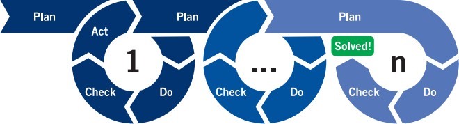
- When leading the meetings, it should not be a priority for the Office of the Director of Training to home in on governance KPIs, but rather to detach itself from existing KPI structures so that new and improved metrics can be found.
- To truly report on quality of learning, it is important to attempt to cover the innumerable subtle differences in learning design necessary to accommodate the various topics represented at the ITCILO. These nuances can only be discovered and reported on by the activity managers, tutors and coaches working directly with
participants.
Recommended implementation technicalities
- Establishing an overarching data-lake system to be integrated with the existing data warehouse to speeds up many everyday processes.
- MOOCs should be integrated into the current data flow (listed in MAP) and regarded as “first-class citizens” due to their increasing importance.
- Establish a way of measuring similar courses.
- Proposed roadmap (implementation through an agile process/PDCA cycle): 1) collecting missing data, 2) extraction via Kettle, 3) processing and possibly taking the time dimension into consideration, 4) tracking the success of new indicators, 5) creating new stakeholder interfaces, and 6) integrating new interfaces into existing systems and workflows.
Standardization of online learning offers
- To ensure high quality across all offers, and especially to allow for the tracking and analyzing of learner performance, some aspects should be standardized. This should be the ongoing result of the continuous PDCA process, which sets and refines minimum quality benchmarks for all courses.
- Standardization should always follow first principles and merely provides a necessary shared skeleton for each course.
- the KPI reporting structure should also respect the innumerable subtleties in learning design and allow for free-flowing innovation to occur, without adding rigid constraints to the process.
- Tools should be recommended based on the desired outcome. Details of these tools could be published in an internal knowledge base to save all activity managers time during course design and to enforce the minimum quality criteria set for tools used in ITCILO courses.
- Establish a Standard Operating Procedure for Course Activities. This collection of documents could serve as a common basis for all activities within the organization. A standardization metric could be devised to determine what percentage of courses follow the procedure.
- The knowledge base should also convey examples of good practice, not only for a complete course set-up in different scenarios but also for specific niche edge cases.
- Due to the ever-increasing demand for a high degree of data literacy and good digital skills on the part of all Centre staff, we suggest that a concerted effort be made to improve the average skills level in these fields. We recommend making these opportunities mandatory in certain situations and focusing on quickly spreading the knowledge gained. Also, these considerations should be taken into account in the recruitment process.
The dashboards will only ever be as good as the questions asked while developing and using them
7. Towards level 4!
- Dedicated attention needs to be paid to examining complex correlations in data or entirely new areas of learning innovation that go even further.
- Re-iterate the micro levels of dashboards.
- Epistemic analysis of user contributions on courses.
- Deep learning applied to compounding of indicator data.
- Measure the impact of the dashboards on staff and participants.
- Reinforce the use of certain didactic scenarios.
- Introduce tools for deep analysis.
- Deeper integration of arbitrary TinCan modules.
- The indicators described in this report could serve as the basis for proactive communication with participants via email or push notification.
- A smart learning algorithm could be used to identify which participants are at risk from the very beginning, based on similar profiles that have been at risk in the past (predictive analytics).
- The dashboard can proactively notify staff as to which participants are at risk, without the need for regular checking of detailed dashboards.